
According to Janet Berger, strategist at Flow Communications, and Elmarie Harrington, head of graphic design at Flow Communications, infographics are simple, visual representations of information. We encounter them everywhere, from road signs and maps to directional signage in malls or museums, and they’re great evidence of the power of design to make people’s lives easier.
When Henry Beck designed the famous London Underground map in the early 1930s, he ‘stripped the sprawling Tube network down to basics,’ creating an easily comprehensible chart that today covers nine zones and 11 colour-coded lines.
Regarded as a design classic (and voted as one of Britain’s top three favourite designs of the last century in 2006), the schematic map uses only vertical, horizontal and 45-degree diagonal lines.
It’s a superhero of clever infographic design, giving travellers on the Underground all the information they need, for example: ‘Am I on the right line?’; ‘How many stops to my destination?’ and ‘Am I going in the right direction?.’
So why should you consider using them in marketing? With attention spans notoriously getting shorter, they offer a snappy way to get messages about your brand across quickly, from what you do to how people can obtain your services.
A compelling infographic offers something useful to the viewer, gets to the point quickly, doesn’t require a genius intellect to decode, and aligns with your brand (visually, as well as in tone).
A Clear, Simple Message
Infographics offer a simple way to add interest to your website using diagrams or charts that explain concepts in an engaging way. In fact, they’ve become part of our ‘visual language,’ we instinctively know how to read graphs, charts and maps.
During the Covid-19 pandemic, we were bombarded with them, allowing us to quickly scan infection rates in our area or country, or to see whether numbers were going up or down.
They are essentially short-hand for copy that may be dense or complex, so it’s vital to always put your viewer/reader at the centre. What is your customer looking for? Also, who is your audience?
One fascinating, fun example is American artist and self-confessed ‘tech nerd’ Adam E McCann’s captivating representation of the work of the Beatles. See it here.
The infographic clearly shows which group member wrote which of its songs, and which songs were hits. It looks deceptively simple, with beautiful use of colour, but it offers a lot to unpack and decode, using weighted strokes, simple icons and a clear timeline.
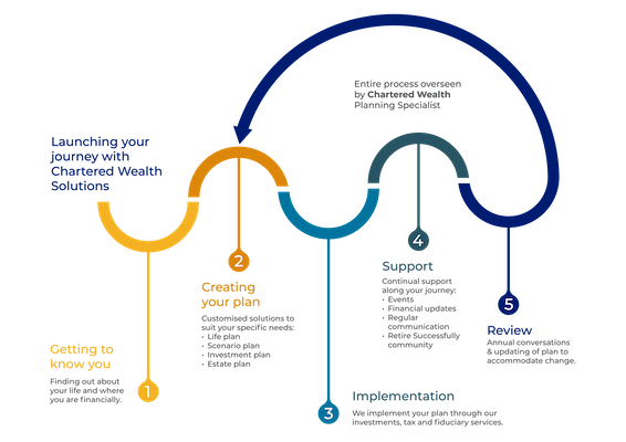
But infographics are not only fun, they can be serious business, too. Below is a relatively simple process chart we developed for a client, Chartered Wealth Solutions, showcasing its offerings and what a customer’s typical journey with the company might look like.
Instead of running five paragraphs of copy on Chartered Wealth Solutions’ site, we opted for a visual that clearly shows the five ‘steps’ of the journey. The infographic adheres to the company’s corporate colours and, as a bonus, can also be used in presentations, to illustrate social media posts and form part of other corporate collateral.
As with other areas of design, consistency of look and feel is important when you create infographics. And the context of where they will be used is critically important.
Infographics are often used in museums and exhibitions, where visitors can easily get bored by text-heavy graphic panels. In such a context, you must consider how big your infographics are going to be, from what distance they will be viewed, and how much time the viewer will have to engage with them. What is the visual literacy level of your audience? Combining short-form content with enticing visuals makes content more pleasurable to engage with.
Mind The Pitfalls
Infographics have become such a significant part of our everyday lives that we almost universally know how to interpret them, without really acknowledging the level of decoding required. A good infographic allows you to interpret it correctly, unambiguously and easily.
Along with this ease of communication comes responsibility, so consider the sources of your information and statistics carefully, and ask yourself if the information is reliable, current and solid.
Anything misleading or untrue could be dangerous to your brand (even if your intentions are good), so make sure your message is right on point. Also, remember to bear in mind cultural norms and sensitivities, if your icons depict people, what are they wearing and how are they represented? What may look like just a nice picture is often loaded with meaning.
Our new universal visual language of emoticons is usually lighthearted and fun, and often these mini infographics are used to add nuance, spice and tone to communications, but be conscious of where, when and how you use them: some emojis can be seen as culturally insensitive in certain contexts.
Also, they may not always depict what you think they do (what we thought was a fried egg turned out to be a daisy!) and it’s generally not appropriate to use them in corporate culture or business communications. Not yet, anyway,
What Not To Do
Complex infographics that are difficult to decipher and try to say too much are doomed to fail. If viewers can’t understand or engage with an infographic, your message will be lost on them.
Have a look at the complicated ‘Your New Health Care System’ flow chart here. It was created by representatives of the United States Congressional Joint Economic Committee in 2010 to map the Patient Protection and Affordable Care Act (‘Obamacare’). Unsurprisingly, the writers of this piece describe it as ‘utterly incomprehensible’.
Some Key Points To Consider:
• What do you want your reader to know?
• Is your information reliable and approved?
• Test-drive your infographic before going ahead, is the viewer able to understand and interpret it properly?
• Make sure your ‘visual language’ is relevant to the brand and its corporate identity, is easy to grasp, and effective.
• Pay attention to hierarchy, what will the viewer read first, second and third?
• Finally, test the infographic where it’s going to be used.
FLOW COMMUNICATIONS
https://www.flowsa.com


