
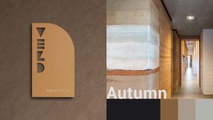
Veld Architects’ new logo draws inspiration from the architectural process itself, with the ‘E’ symbolising building brick by brick. The result is a bold yet sophisticated brand expression – one that captures Veld’s passion for nature while showcasing their professionalism and expertise in high-end residential and commercial design.
Its horizontal elements also evoke architectural structures viewed from above, and the angular ‘L’ conveys dynamic precision. The solid first and fourth letters nod to Veld’s signature style: elegantly understated designs. Overall, the wordmark balances professionalism and structure with a playful energy that reflects the dynamic team behind the brand.
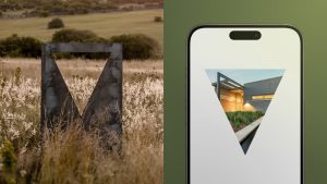
Building from the new wordmark, a triangular ‘V’ form was extracted to create a flexible graphic device. This ownable and impactful shape serves as a frame for showcasing Veld’s work, ensuring the brand remains recognisable while allowing the architecture to take centre stage.
Given Veld’s deep connection to nature, new seasonal colour palettes were developed to capture the changing moods of Summer, Autumn, Winter, and Spring. This evolution extended to typography, with the introduction of Google fonts for greater accessibility and seamless cross-platform application. A new sans-serif typeface complements the colour palettes in that it embodies Veld’s focus on simplicity and elegance.
‘At Sunshinegun, we believe that a strong visual identity should be as purposeful and considered as the brand it represents,’ said Sikhumbuzo Khoza, Group Account Director at Sunshinegun. ‘Veld Architects’ commitment to sustainability and beautifully crafted spaces inspired us to develop a design system that truly reflects their ethos. We are proud to have played a role in shaping their visual story.’
SUNSHINEGUN
https://www.sunshinegun.com


