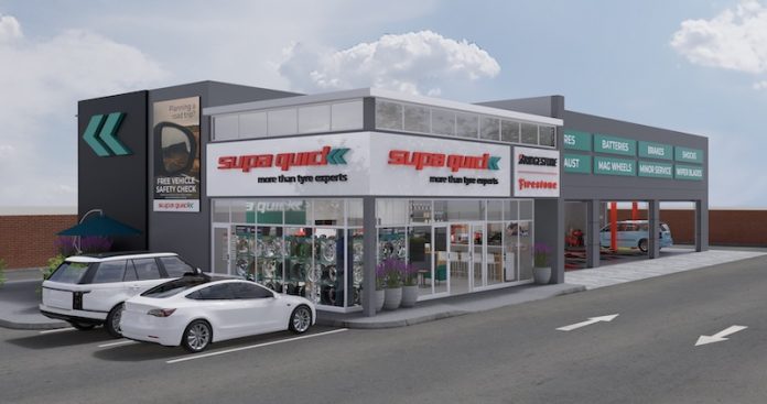
Supa Quick’s new look-and-feel is coupled with an updated brand positioning and a fresh approach to customer relations. Around 200 fitment centres are expected to revamp to the new look-and-feel in the next few years, from in-store design, corporate assets, processes and philosophy. The designers behind the creative look-and-feel are Willem Viljoen and Seyurie Naidoo from A|Seylem DSGN CNSLTNCY.
In addition to the modernisation of its corporate identity and visual image, the franchise is updating its positioning from ‘Tyre Experts Closer to You’ to ‘More Than Tyre Experts’. Tyres are still Supa Quick’s core business, and it is what the brand is known for, but since first launching in South Africa in 1986, it has come to be known for much more, having expanded its technical expertise.
Among many benefits, Supa Quick expects to differentiate itself in the market by becoming more female-friendly, with cleaner, more modern and less intimidating spaces, using more neutral colours in waiting areas.
‘Our brand identity is built on many individual parts, all of which play an important role in who we are,’ said Yolandi Grundeling, Supa Quick brand manager. ‘From our logo to our specified fonts and corporate colours, all the way down to how our employees and how our customers are treated, these elements create the integrated corporate identity and how we are perceived.’
‘The essence of the brand goes beyond our logo, typography, customer service, quality, and corporate identity – it’s emotional, visual and historical. It’s about how we connect with our customers in a unique brand experience that separates us from our competitors. While we look for a unified identity, we want to retain some flexibility in each individual store,’ Grundeling added.
Supa Quick
https://www.supaquick.com


