Bone SA engaged the creative minds at Riverbed to conceptualise a name, logo and corporate identity for a facility created to address the enormous need for donated bone and tissue products in South Africa.
With the opening of a brand new, state of the art tissue engineering facility in Cape Town, Bone SA, a registered non-profit organisation that distributes bone and tissue products to the medical fraternity, knew that the name, look and feel of the new facility had to reflect its ethos and objectives in an accessible, but beautiful way.
Vitanova – or new life – was a name that immediately resonated with the stakeholders for the way in which it succinctly expresses the purpose of the facility in an impactful way. ‘Vitanova will not only save lives; the tissue bank will also create life,’ said Tumi Sethebe, Executive Creative Director of Riverbed.
The question at the heart of the creative process was how to turn something that’s essentially a cold subject, rooted in hard science, into a brand that the public wants to interact with. The answer, Sethebe said, is ‘You make it as human as possible.’
Drawing inspiration from the ‘imperfect beauty of the human body’, Riverbed set to work to create a brand that inspires confidence, while subtly referencing the preciousness of human life.
This imperfect beauty is seen in the organic feel of the Vitanova logo, with the ‘o’ that’s slightly off its axis to further acknowledge the nuances of beauty, while the two dots above the ‘i’ symbolise birth and rebirth, ‘the endless continuity of life’s cycle’.

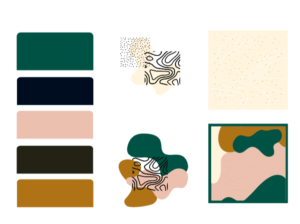
The representation of ‘new life’ is visible in the colour palette that favours green for its association to growth and new beginnings, while pink as a secondary colour represents the blood flowing in our veins, the ultimate sign of life.

Rather than a single identity, the brand images serve to represent human bodies as a collective, with soft light and smooth angles. ‘The message is that bone and tissue matters are a collective concern, a human issue,’ said Sethebe.
For Bone SA, this visual interpretation of the tissue facility’s goals were spot-on. ‘Riverbed immediately understood what it is that we want this brand to convey – it’s that fine balance between evidence-based science and the human body – and they were spot on with the name, the colour palette, the typography and treatment of images. We specifically looked for an agency committed to affecting social change, which just added to Riverbed’s suitability for the job. We’re delighted by the outcome,’ said Sarita Mans, Marketing Specialist at Bone SA.
‘This project reawakened us to the wonder of the human body and what it is capable of. We knew we had to take the science and bring a human element to it, as a key part of ensuring people respond positively and comfortably to the work of Vitanova,’ Sethebe shared.
THE RIVERBED AGENCY
https://www.theriverbedagency.co.za/


